The year 2024 marks a significant shift in the realm of web design. As we navigate this digital age, there’s a palpable move towards simplicity, clarity, and user-centric design. This evolution is aptly termed as “Evolving Minimalism.” But what’s driving this change? Let’s embark on this enlightening journey.
The Rise of Minimalistic Web Design

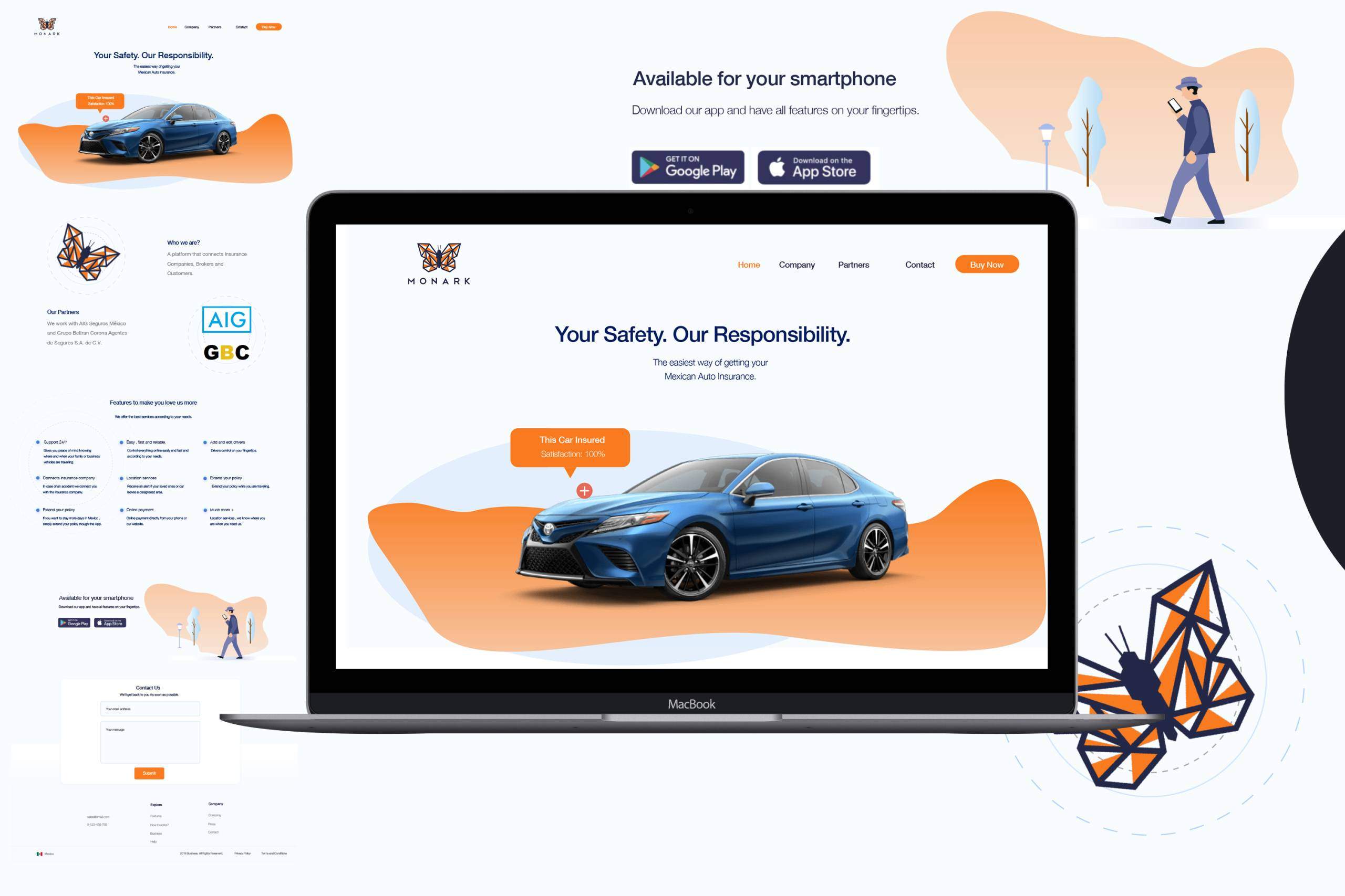
Minimalistic web design is all about stripping away the unnecessary and focusing on the essential. It’s not about being bare-bones but about enhancing user experience through thoughtful reduction.
Example:
- Apple’s website exemplifies: Instead of bombarding visitors with information, it showcases its products through high-definition images, simple typography, and ample white space, allowing the products to shine.
- Google’s Search Home Page: A simple search bar in the center with a white background. No distractions, just focused on the search function.
- Medium’s Blog Platform: Clean layouts with an emphasis on the written content and minimal side distractions ensure readers stay engaged with the story.
- Squarespace Templates: Offers designs that prioritize content with ample spacing, clear typography, and a limited color palette, enabling businesses to present their brand without clutter.
- Trello’s User Interface: Utilizes a card-based design. Each card represents a task, and boards represent projects. The simplicity helps users manage tasks without feeling overwhelmed.
User Experience at the Forefront
The essence of minimalistic design is to prioritize the user. By eliminating distractions, users can find what they’re looking for with ease and efficiency.
Example:
- Spotify’s web player, with its intuitive dark theme and clear categories, ensures seamless music enjoyment.
- Amazon’s One-Click Purchase: Streamlines shopping with a single click for quick purchases.
- Airbnb’s Intuitive Search Filters: Tailored search options for specific accommodation needs.
- Dropbox’s Seamless File Syncing: Easy file access across devices without hassle.
- Duolingo’s Gamified Learning: Makes language learning engaging with game-like challenges.
Speedy Load Times
A minimalistic design, by virtue of having fewer elements, ensures quicker load times. This is crucial in an age where users expect instantaneous results.
Example:
- Google – The world’s top site, sets the example. Its simple homepage loads instantly, ensuring a seamless user experience.
- Medium – The online publishing platform’s clean design ensures quick loading of articles, keeping readers engaged without wait.
- Stripe – The online payment gateway offers a minimalist interface, ensuring businesses can process payments swiftly without lag.
- BBC News – Their mobile app is optimized for quick loading, allowing users to access the latest news stories in an instant.
- WhatsApp – The messaging app’s simple interface ensures messages are sent and received in real-time, providing an uninterrupted communication experience.
Why Minimalism? Why Now?
In today’s digital age, the trend towards minimalism is a reflection of society’s desire to combat information overload, yearn for simplicity, and improve user experience. It’s influenced by the omnipresence of mobile devices that necessitate responsive designs, a growing awareness of sustainability and resource efficiency, and an aesthetic appeal that aligns with modernity. Rather than a mere design choice, minimalism is a thoughtful response to the complexities of modern life, offering clarity and focus in a cluttered world.
Mobile-First Design

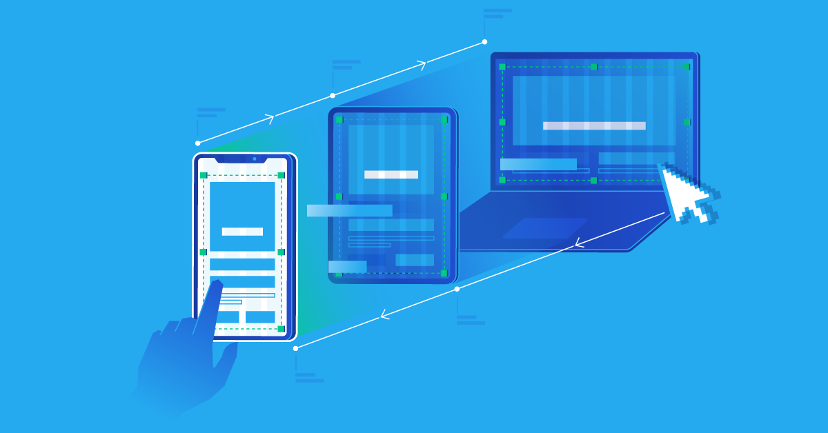
With the proliferation of mobile devices, websites need to look and function optimally on smaller screens. Minimalism aids in this by reducing clutter.
Example:
- Instagram – Primarily a mobile application, focuses on images with minimal textual distractions, making it perfect for mobile viewing.
- WhatsApp – Designed primarily for mobile, its simple chat interface ensures smooth communication without unnecessary features crowding the screen.
- Uber – Its app-centric design offers an intuitive booking experience, with a focus on maps and ride details, optimized for quick mobile use.
- Snapchat – Built around quick photo and video sharing, its interface is optimized for mobile screens, emphasizing camera functionality.
Attention Spans
In the digital age, attention spans have noticeably decreased, making it imperative for websites to deliver content swiftly and succinctly. With the constant influx of information and distractions, users now expect content to be concise and engaging, requiring websites to adopt strategies such as scannable content, visual elements, and an impeccable user experience to retain their audience’s fleeting attention.
Example:
- News outlets like BBC have adapted by presenting news in bite-sized chunks with clear headings, catering to today’s fast-paced readers.
- Twitter’s 280-character limit ensures messages are short, direct, and easy to consume in seconds.
- TikTok’s 3-minute video clips cater to audiences looking for quick entertainment bursts.
- Infographics, often used by marketers, provide visual data summaries for quick insights.
- Spotify’s playlists often start with popular songs, capturing listeners’ attention right away.
Aesthetic Appeal
In the vast digital landscape where users are bombarded with information, a visually appealing design stands out. It not only captures attention but also conveys a brand’s ethos and identity. By ensuring a clean and uncluttered design, brands can evoke positive emotions and ensure a memorable user experience.
Example:
- Tesla’s website, with its muted color palette and high-quality images, provides a visually pleasing experience for visitors.
- Apple’s Product Launches: Minimalist slides that focus on the product.
- Airbnb’s Photos: Authentic, high-quality images from hosts.
- Instagram’s Interface: Dominated by images with minimal text, prioritizing visual content.
Also Read: Web Design Trends for 2024: The Future is Now
The Role of Color and Typography
In the realm of minimalistic design, the choice of color and typography transcends mere aesthetics. These elements are foundational, setting the mood, guiding user attention, and ensuring clarity. The right color can evoke specific emotions, while the correct typography can enhance legibility and establish hierarchy in content.
Example:
- Google’s Use of Blue: Google’s primary blue, especially in links, is more than just a color choice.
- Apple’s San Francisco Font: Apple’s San Francisco font isn’t just modern and clean; it’s optimized for legibility on screens, ensuring that text is clear and easy to read across all Apple devices.
- Slack’s Purple Theme: Slack’s purple theme does more than just stand out. It creates a calming yet vibrant workspace atmosphere, encouraging collaboration and communication.
- Netflix, with its signature red and black theme, not only establishes brand identity but also evokes feelings of excitement. The simple typography ensures readability across devices.
Wrap Up:
Evolving minimalism in web design is not just a fleeting trend for 2024; it’s a design philosophy rooted in enhancing the user experience. As the digital landscape continues to evolve, minimalism stands out as a beacon, guiding designers towards creating user-centric, efficient, and aesthetically pleasing websites. The future, it seems, is minimalistic. Are you ready to embrace it?
FAQs
Q: What is Evolving Minimalism in Web Design?
A: Evolving Minimalism combines the core principles of minimalism with innovative design elements to create websites that are not only aesthetically pleasing but also highly efficient in conveying information and engaging users.
Q: How does Evolving Minimalism differ from traditional web design?
A: Traditional web design often adheres to fixed layouts and designs, while Evolving Minimalism is dynamic and responsive, ensuring your website can adjust to various screen sizes and emerging design trends.
Q: Is Evolving Minimalism suitable for all types of websites?
A: Whether you run a small business, a personal blog, or a large e-commerce platform, Evolving Minimalism can be customized to meet your specific requirements, enhancing user experience and engagement.
Q: Will Evolving Minimalism affect the loading speed of my website?
A: Evolving Minimalism’s focus on streamlined design and efficient coding ensures that your website not only looks great but also loads quickly, enhancing user satisfaction and SEO performance.
Q: Can I incorporate branding elements into an Evolving Minimalism design?
A: Your brand’s identity is important, and it can be seamlessly integrated into an Evolving Minimalism design. This way, you can maintain consistency and recognition while enjoying the advantages of modern web design.
Looking to boost your online presence and deliver a remarkable digital experience to your audience? Look no further than Ghurki Design. Our team of skilled UI/UX designers is passionate about bringing your vision to life with captivating and engaging designs.


