What is our UI UX Desing Process
We use design thinking to craft bespoke design solutions for our customers
Define the problem:
We love design but we don’t it right away. Before we move into any design, we always ask our cliemts questions to understand why we’re doing it. This can only be done by clearly understanding the underlying issues that will be resolved by this product we are going to build. We design better when we have clear understanding of the problem we’re trying to solve.
Clearly define our users:
As saying goes “If you are designing for everyone, you are designing for no one”. If we dont know for whom we’re solving the problem we cannot propose any solution. The actual things they might face in their day-to-day life can help us understand which solution suits them the best and can be of actual utility for them. Before we start desigining we discover these things in research and clearly define them before we start any actual design work.
Ideate:
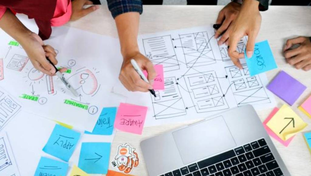
To help us understand the complexity of the product and answer important questions before we get into things like page layout and UI we utilize design practices like design thinking, story mapping and sitemaps and the lowest fidelity versions of the product we’re building. This helps the user to understand how his problem can be solved. If it is not the best solution the we gather his feedback which helps our next sprint.

Defining core feature set which best solve the problem at hand:
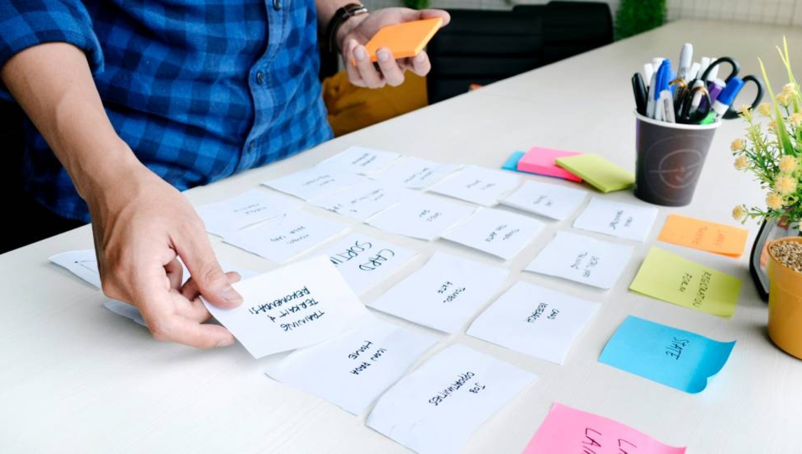
After understanding the core functionality, we use user stories to pick the best solutions from solution set to avoid any distractions that might mislead the user from the solution along the way. This helps us designing the product which is just right according to the need of the hour.
Low-fidelity wireframes:
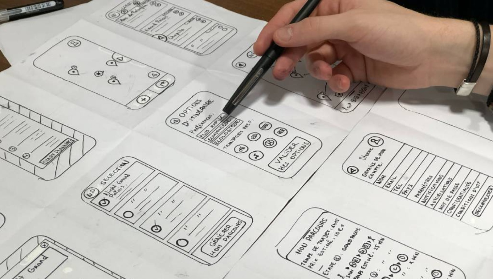
Once we understand the problem, ideate the solution and lock the direction of the product and general hierarchy is in place based on user stores, we start ideating what these actual pages can look like.
In this wireframing stage, we have two main goals
Trying to understand things like layout
Managing the content, what goes where.
However, here we do not use the actual/real content but this is the stage where we decide the placing of content also it helps user to do first degree of testing with our wireframes. So we get a better understanding of all the content and subpages that will need to exist.

High-fidelity wireframes/design system:
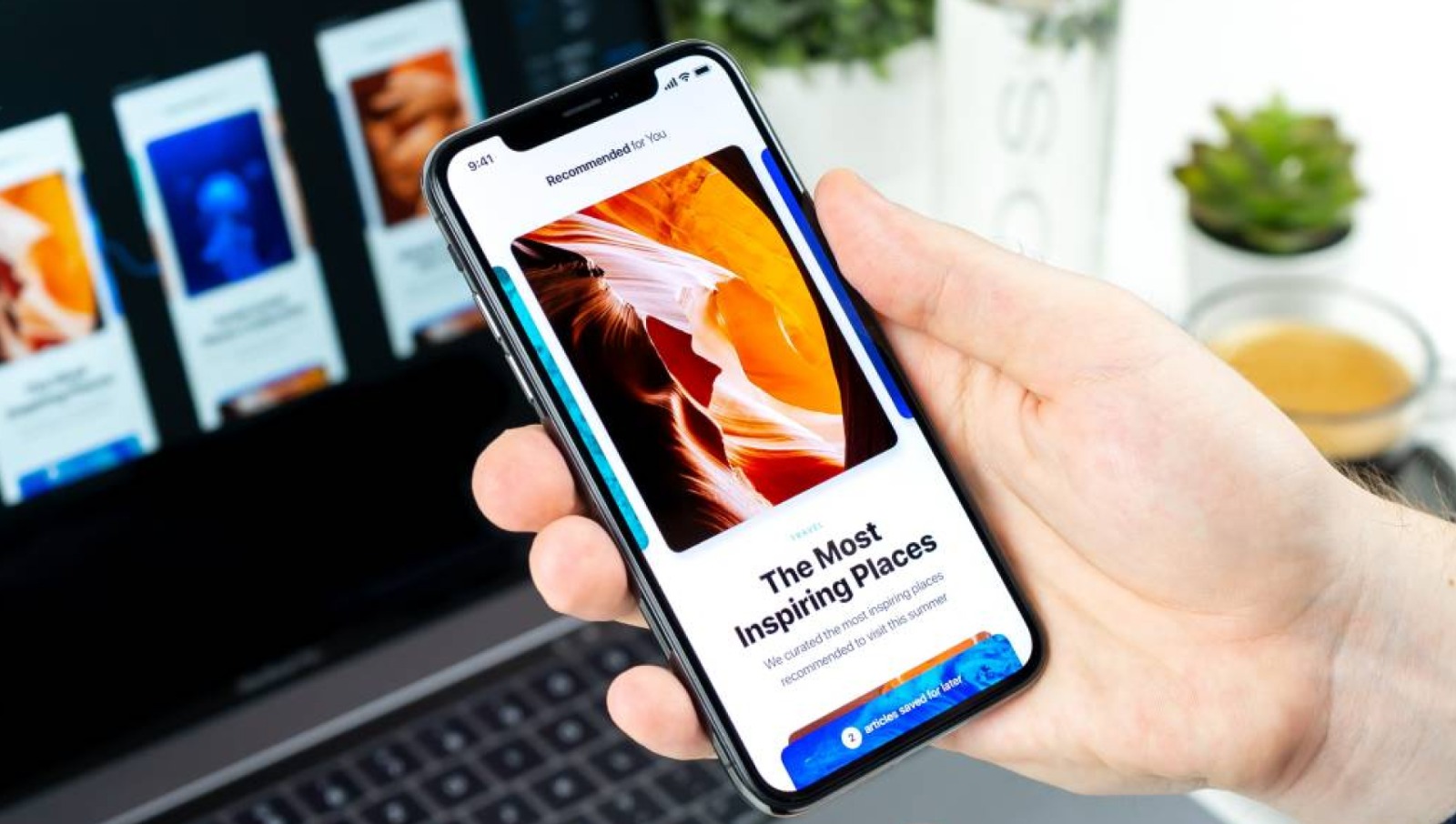
So this is the final stage, we combine all the keypoint from previous stages and carefully study the visuall brand guidelines and put all pieces together in high fidelity user interface design with full complexity just as user will see it and can use our clickable prototype to have real like experience of the application.
We built the design system that can be used by developers in the hand offs and we can render the pages which can be utilized in usability testing before it goes to actual development.

Our Best UI/UX design Practices
Some of pur best UX/UI best practices are:
- We solve ONE problem completely then addressing multiple partially
- Creating user stories at an early stage.
- We map out the project complexity before jumping into it.
- We do not focus only on the design but the product goals.
- Design follows funtionality: we believe this we act on it.
- We design for having users in mind.
- Good design is only good if its feasible.
